

A Unique and Inviting Kitchen Remodel Before and After
This adorable house in nestled among a luscious natural landscape overlooking the rolling hills of the Santa Ynez wine country in California. One of its best features is the warm, natural sunlight that pours in from every direction. Our client wanted an inviting place to entertain guests with a slightly contemporary feel. She asked us to incorporate some casual elements that speak to the easy, breezy lifestyle of Santa Ynez and her own personal life.
Before…
Although the kitchen was outdated, it had a good layout that the client had grown used to which provided adequate storage and since removing walls was not an option, we felt we had some pretty good bones to work with. On the top of the client’s list was modern and clean overhead lighting, black matte plumbing fixtures, new appliances (except for the refrigerator), glass tile backsplash and a charging station for her devices.

We got to work right away by visiting local showrooms to select our tile, plumbing, cabinetry, countertops and appliances which we presented these ideas to the client in a moodboard format along with real samples of our selections, and also drawings, elevations and 3D visuals to help her see it all come together. Of course, she was instantly delighted with the new fresh approach we were proposing!

Although we weren’t changing the layout, we did change the cabinetry configuration to create symmetry around the sink and stove area. We added a lot more drawers and much needed pots and pans storage plus even a cool charging station inside one of the drawers! We selected two cabinetry for two reasons: our client didn’t want an all white kitchen, and we felt that all stained wood cabinetry was going to make it look too dark and small in this already small space. The solution of combining white and stained cabinetry gave us the casual approach of a bright and inviting kitchen that we were after.

After…
The finished result is a bright, sun filled kitchen with a soothing color palette of the soft blue glass tile backsplash, warm cabinetry in a two-tone color combination, contrasted by matte black hardware. We removed the outdate grid lighting which seemed so overwhelming in the small kitchen and added simple recessed lights for a clean look. Since the ceilings are only 8’ high we opted for no chandeliers or pendants. By taking the backsplash all the way to the ceiling it gives the illusion of added height. I specially love the sleek modern lines of the black matte Brizo faucet with a hint of gold and the reflection of the glass tile. It adds such elegance to this space!


Remember what it looked like before? Uninspiring, cramped and cluttered.

Before
Now, it’s a happy and bright kitchen with a small breakfast nook, a perfect place to drink a cup of coffee or sip a glass of Chardonnay with friends. This quickly became the client’s favorite spot where she can also enjoy the beautiful views of the natural landscape that surrounds this home.

I’ll let you in on a little secret…the client isn’t much of a cook. But I hope that this beautiful new cooking area has inspired her to make some yummy dinners.


Thanks for following along. To view more images of this project click here. If you’re thinking about renovating your kitchen, and need advice and guidance, we’re here to help!
xo,
Claudia

Top 10 Things To Avoid When Updating Your Living Room
We've all been there. We see the sofa of our dreams, the color is perfect, the fabric is a so soft and it's on sale! We buy it. We bring it home. It wont fit through the door! Hubby takes off the door to give you an extra inch, you angle it and strategically maneuver it through, you position it exactly where you envisioned it - Oh, wait...it's too big!
Well, it's one thing to actually realize it's too big. Most people however don't see it, and they leave it, and continue buying furniture to complete the room that is too big, too small, the wrong shape etc.
Today I'm going to share with you my top 10 tips on what to avoid when furnishing your living room - but this can easily apply for any room in your house really.
Here we go!
1. OVER-SIZED FURNITURE
Ok, you guessed it. Avoid buying furniture that is simply too big for the space. Resist the urge to buy the complete living room set that has the matching sofa and loveseat plus the matching coffee table and two side tables. Really take the time to plan out your living room layout BEFORE you buy absolutely anything. By having a floorplan you'll have a road map of what pieces you need and how big they should be. You will save yourself lots of trouble and money if you take the time to do a little planning first. It is not hard. You can do it. Simply take some graph paper and draw your room to scale. 1 square = 1 foot. Remember to include any windows, doors, fireplace and built-ins. Take note of the dimensions of the furniture you are considering and draw them into your floorplan. You will be surprised at how many times you'll have to re-consider a piece simply because it is not the right scale. And, yes, measure the width of your doors to ensure your stuff will fit :)
If you're feeling ambitious check out this post from A Beautiful Mess that walks you through how to draw a floorplan AND the furniture so you can cut it out and play house!

Image Source: A Beautiful Mess.com
2. SMALL RUG
When I was a Realtor I worked with more Buyers than Sellers. So I've seen my fair share of homes. I can't tell you how many times I walked into a living room where the rug was just the wrong size - usually too small!! DO NOT DO THIS!

Image Source: Google
Most of us living in average sized homes with average sized living rooms will need an 8' x 10' or a 9' x 12', period. Do not even consider the 5' x 7' let alone the 4' x 6'. Just don't do it! A rug so small that only the coffee table goes on it, just looks bad and really serves no purpose except to draw attention to the fact that it's the wrong size. Designers always say that "a rug anchors the space" but what does that mean you ask. In my opinion, a rug in a living room should define the conversation area. If the room is particularly big and the seating arrangement is floating in the middle of the room, then having a large rug where all the legs sit on the rug will be the best option. However, in a smaller room perhaps where you do have a sofa against the wall, then having only the front legs (of the furniture pieces) on the rug is just fine. Be sure to be consistent all the way around with whatever option you choose for your situation - either all legs on the rug or just front legs on the rug. Check out this handy diagram below as a guide!

Image Source: www.ishouldbemoppingthefloor.com
3. PICKING PAINT COLOR FIRST
We are all guilty of this. Even I have done this! We fall in love with a paint swatch, we put it up on the walls and then design a room around that paint color! Then we end up driving ourselves nuts hunting endlessly for the right pillows, accessories and curtains that will match perfectly with that paint color. Well, I learned many, many years ago that paint color is one of the very last things one should select. There are a million and one paint color choices out there, so choosing the right shade of blue for your space AFTER everything else has been selected will not be that difficult, I promise! If you're wondering here's my process in a nutshell: I like to begin by selecting the most prominent pieces - sofa, accent chairs and fabric colors and textures. I feel that that starts to give the room it's style and direction. Then based on that I will select a casegood, coffee table, end tables and lighting. Then I focus on artwork, rugs, window treatments and accessories, and lastly paint.
4. NOT ENOUGH LIGHTING
Lighting is so often overlooked. We simply think that since we have recessed lighting in the room already that no additional lighting is needed. Wrong! In my opinion, lighting in a room is like the jewelry that completes an outfit. Having a nice prominent light fixture can add so much elegance and drama to a room. Additional floor lamps and table lamps can also add the right amount of ambient lighting and romance in the evenings when trying to keep it moody and cozy. Best of all, lighting nowadays is so gorgeous! How can one resist not to use beautiful lighting to complete a room?! I like to keep recessed lights and chandelier on dimmer switches to control the brightness. And don't forget about candles and battery operated candles as a source of lighting too. Having battery operated candles in lanterns or wall sconces set on a timer throughout your house adds such a nice ambiance in the evenings, whether you have company or not. Enjoy those little details!

Image Source: Pottery Barn
5. TOO TRENDY
Don't get too caught up in the trends! If not done right they can make your room look chintzy or like a furniture showroom. This beautiful and luxurious room is perfect for a Z Gallerie, marketing campaign but too trendy for anyone to implement in their home. Once this glam style goes out of style, then you'll have to replace everything!

Image Source: Z Gallerie
A classic, timeless look, with some personal pieces, whether vintage family heirlooms or unique items from your travels, mixed with a few trendy touches is a much fresher approach. You will also end up saving money in the long run. Aim for making your key pieces - sofa, dining table, buffet, casegoods, even a rug - of good quality and classic in style. To add a trendy touch you can select smaller, less expensive pieces like an accent chair in a fun print, or a unique coffee table, an eye catching chandelier or even use an inexpensive rug that makes a statement. Your accessories should be a mixture of classic, personal pieces that tell a story about you, your family and your travels or interests, mixed with a few stylish pieces to keep your room (or entire house) looking updated and in vogue.

Image Source: Pinterest
6. FURNITURE TOO FAR AWAY FROM EACH OTHER
This is one of my biggest pet peeves! Just because there are walls in a room it doesn't mean that you have to put all your furniture against them! This room below has many things wrong with. Let's not go there. Let's stick to avoiding placing furniture against the walls...

Image Source: Google
If you a *blessed* with a large room, use a rug to anchor the space and create a wonderfully intimate conversation area. Place a console table behind the sofa to act as your "wall" and define the space if the space needs it.

Image source: Pinterest
In a smaller space where furniture must be placed against the wall, be strategic in the placing or your sofa by selecting the right scale for the wall and the room. Avoid having the sofa and love seat combo in a small space, instead opt for the sofa and one or two accent chairs and even some fun stools/ottomans for extra seating without taking up too much valuable space.

Image source: Pinterest
7. ANGLING ALL SEATING TO TV
Ok, this one might actually be my biggest pet peeve! This clearly defines the room as a TV watching room. Instead go for the room that says, "this is a fun room for gathering, for conversing with friends, for playing board games, for curling up on the sofa on cold, chilly nights" you get the idea. Give your room a personality that is inviting and cozy, taking the focus away from the big elephant in the room - the TV. Oh, that brings up another point. The size of the TV...hmmm, this one is a little tricky for us ladies to win. The men seem to always want the biggest TV they can find. That's true in my case. My husband would not let that one go and having to deal with a 50" screen in the living room in no easy task. My advice on that is to make the room as pretty as possible, hopefully all the prettiness distracts from the black whole in the wall! Story of my life!
What I love about this room below is that even though there is a pretty large TV in the room, you still have a sofa facing the fireplace, taking away from the importance of TV watching and thus subconsciously giving importance to conversation and gathering. And see, all the prettiness makes you ignore the TV for a bit!

Image Source: Pinterest
8. DRAPERY PLACEMENT
I know we've all been "taught" (by HGTV) to place the rod as high as it can go. But I don't always like this look. Sometimes it works and other times it doesn't! I almost always prefer to divide the space between the top of the window frame and the ceiling (or crown moulding) AND if space permits I like to extend the brackets several inches (about 10”) beyond the window frame, covering just a bit of the window frame. This allows light to still enter the room and gives the illusion that the window is much bigger.
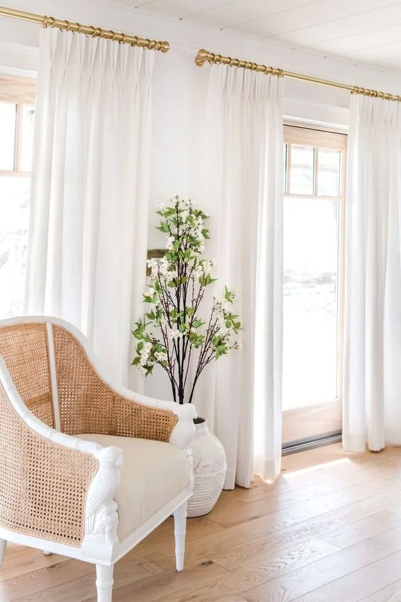
Image Source: Pinterest
Use this diagram to guide you:

Image source: Pinterest
9. ART TOO HIGH OR TOO SMALL
Well this one can be easy to mess up but also easy to fix. Surely you've heard that art should be placed at eye level. Well, eye level for me may not be eye level to you. Most often, I see art that has been placed way too high rather than too low. It's best to aim at placing the center of the artwork around 58-60" high. I also often see art that is just too small for the space. The image below shows art that is too high with a small, teeny tiny piece sitting up there all alone on a big wall with a big sofa... Avoid that please!

Image Source: Google
Take into consideration the size of the wall and the size of the object directly below it. For example, if you have a console table directly below the art piece, I like to keep the art work a few inches smaller than the width of the table. If you have a sofa directly below the artwork on a large wall with tall ceilings for example, then you can select an over sized art piece to make a statement. If your artwork is slightly smaller than you wish It was, a nice trick is to add sconces on either side of the art piece to visually fill in the space.

Image Source: Pinterest
10. TOO MANY SMALL ACCESSORIES
Lots of small accessories of the same scale and height in a room look like dandruff sprinkled throughout. I love using varying scales and heights of accessories to create interest. A good trick is to place smaller accessories on books to give them the height they need next to a bigger object. Also try to stick to grouping of odd numbers, 3 or 5 objects together will look better than 2 or 4.

Image Source: Pottery Barn
If you follow these simple simple rules you will look like a pro and will avoid making costly (and embarrassing) mistakes ;). But, most important of all, have fun when decorating your space. Always make it personal to you, your family and your lifestyle. That's what makes homes so unique and interesting!
XO,
Claudia

A Gloomy Living Space Is Updated to Elegant And Fresh
So as it often happens, you move into a new home and you don’t know where or how to make the old furniture work in the new space. That was the problem in this cozy San Roque home. While we were renovating the kitchen and all the bathrooms in this home, the formal living and dining room didn’t need too much construction work (except for the fireplace wall) so they came together relatively quickly.
Some of the challenges we had were that the windows had wooden shutters throughout and while the wife liked them, the husband absolutely did not. He began to take them down as you can see in one of the ‘before” images below, but after some negotiating between the two spouses, we ultimately decided to leave them in place.


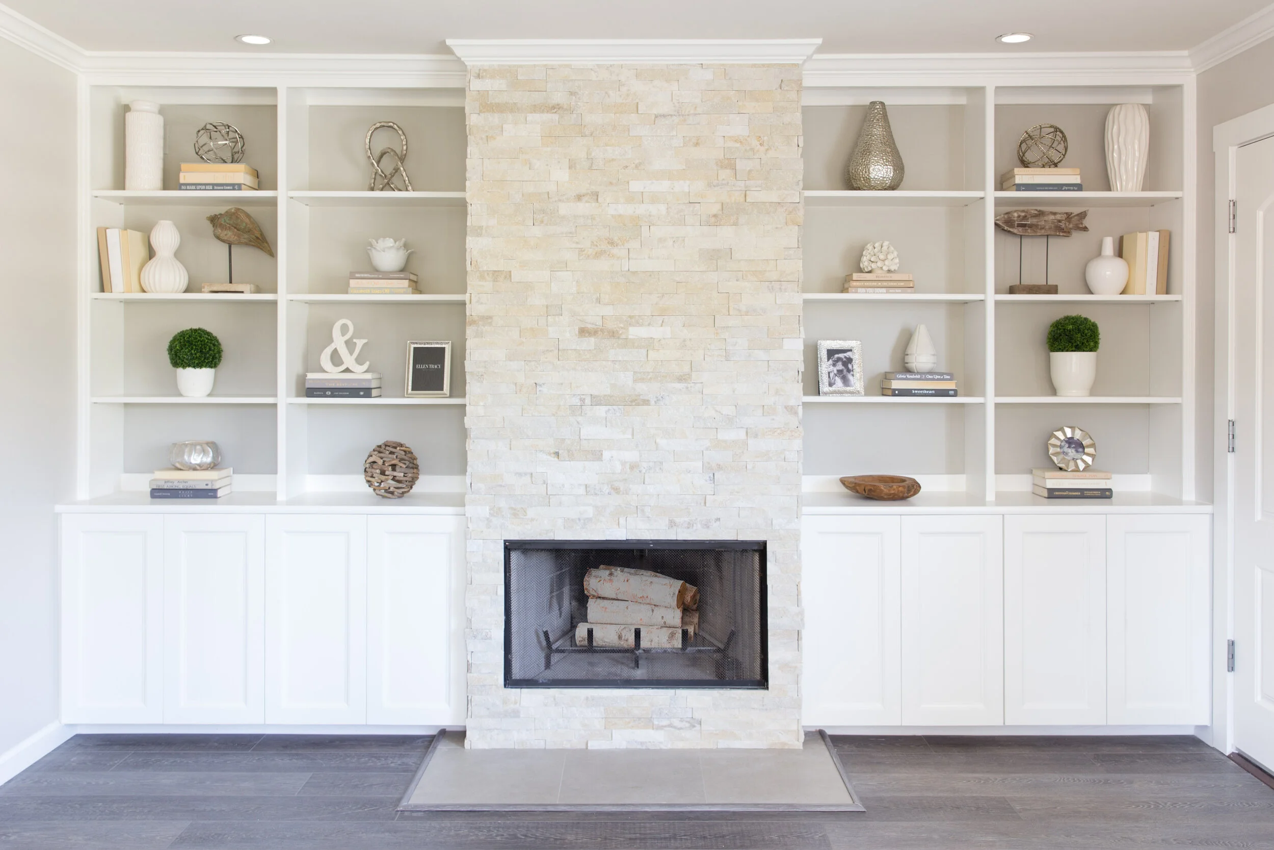
We went back and forth on what to do with this built in system. It provided ample storage and a good place to display pretty little things but the couple couldn’t decide if they wanted to keep the bookshelves or have a clean wall instead where they could display some artwork.

So the design plan was pretty straight forward. Let’s keep it neutral, simple and elegant. Let’s play with the natural light in this room and bring in warm driftwood tones and natural elements like capiz shells and botanicals, sprinkle a little gold here and there and bam! Enjoy a grown up space.

In fact, those were the exact words from my client “I feel so grown up sitting here!”.

We saved a little bit of money by using a sofa they had in another room and using their existing coffee table that they were very fond of.
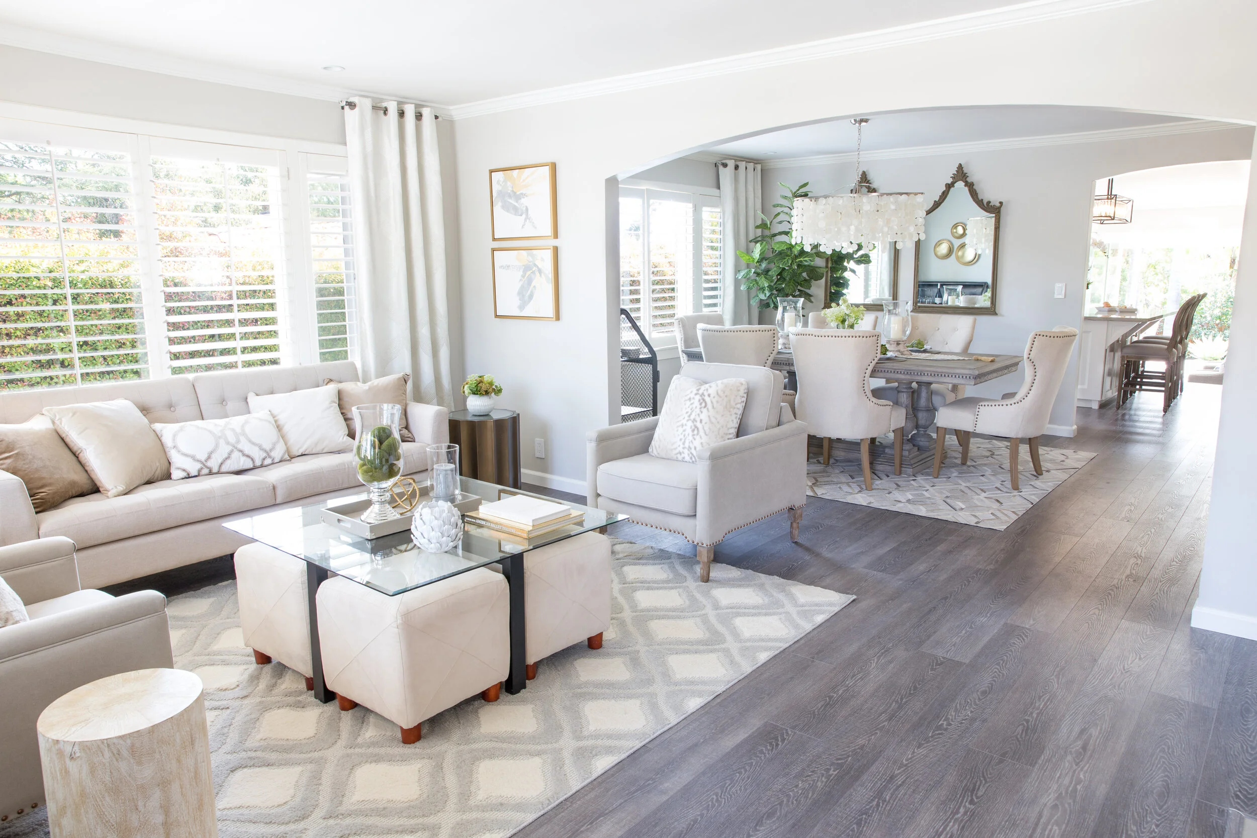
The capiz shell chandelier was definitely a striking addition in this small dining room but my favorite piece is the cow hide rug! And, notice we decided to put back those wooden shutters because after all they did provide privacy but also because they added an extra layer of texture and dimension to this whole space since we didn’t have too many colors or patterns to work with.

In the end, we decided to keep the beautiful built-in cabinets flanking the fireplace. We eliminated some of the shelves, painted the back wall a light grey, refinished the fireplace facade, and added a wood trim to the cabinet doors to make them a little more interesting. We also added some fun knobs (not seen here).


Doesn’t this space look so much brighter and fresher? It is a cool grown up place to hang out and read a book and enjoy some peace and quite!
XX
Claudia
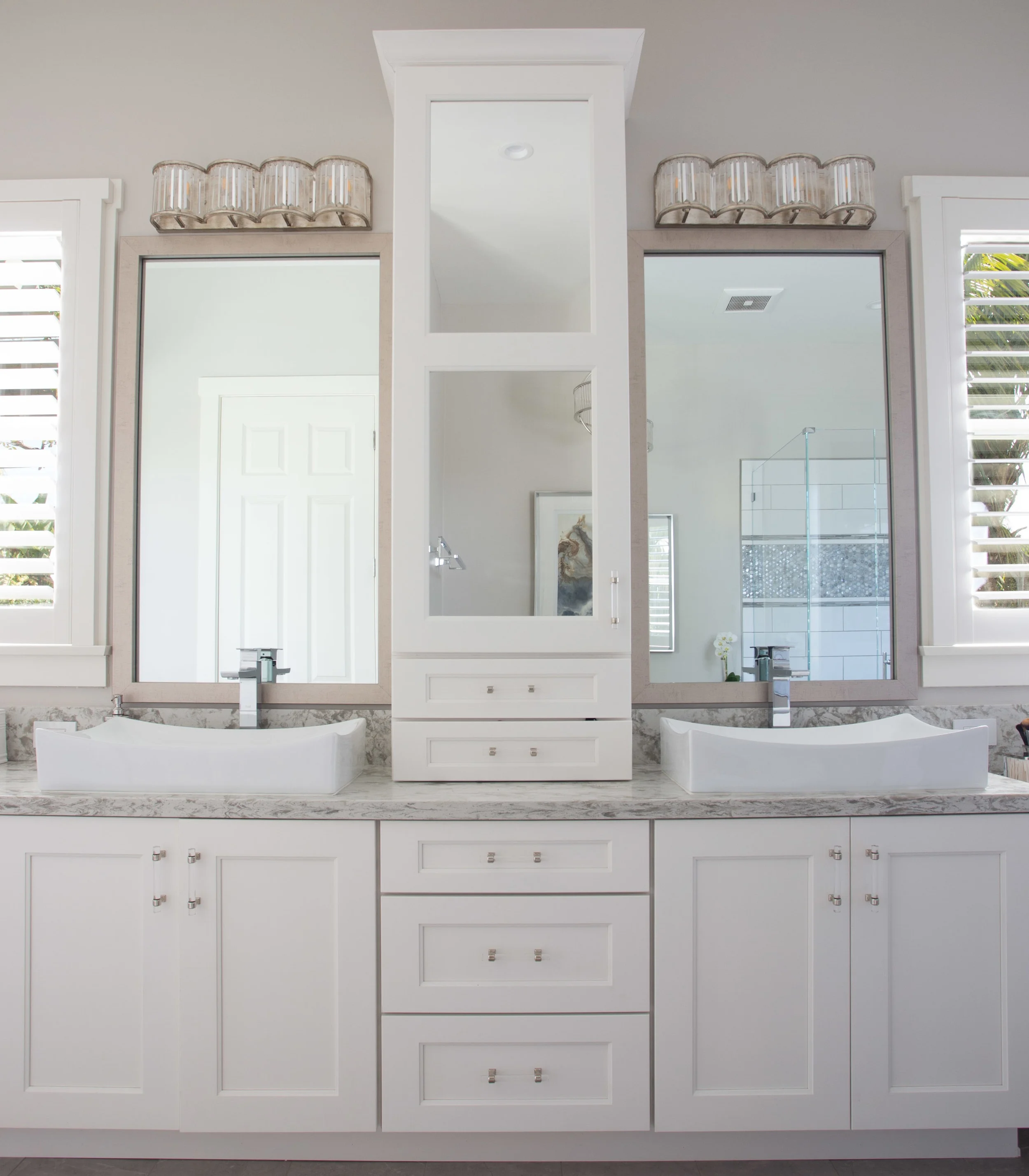
A Glamorous Bathroom Renovation You Need To See To Believe
How should I begin to tell you the massive transformation this long and plenty-full master bathroom underwent? Well, they do say that a picture says a thousand words, so I will let the pictures speak for themselves and I’ll just tell you the basics.
As with every project, we had a few problems to solve. In this case it was a storage problem. Now, I know what you’re thinking - there’s plenty of storage in that bathroom already. Yes, you’re right. This vanity did have massive amounts of storage, however, it was not all functional, and as you can see by all the stuff on the counters, it was not enough!


So I began by dreaming up a glamorous and elegant master bathroom full of natural light, with all new white cabinetry, brushed nickel plumbing fixtures, a sexy free standing bathtub, and just enough bling from the lighting fixtures, cabinet hardware and glass tile to satisfy the Mrs’ request for femininity and sophistication, while keeping the Mr. from jumping out the window.

The next step was designing the massive custom cabinet and adding in some much needed storage. The 3d rendering below really helped the clients visualize their new space. By adding a tower in the center of the vanity I was able to create ‘his’ and ‘hers’ separate spaces. ‘His’ space was off to the left with ample countertop space and plenty of drawers and storage. ‘Her’ space was, well, everything else - the center tower and all the drawers below for all her jams and jellies, the cute makeup vanity because every girl should have one, and the all the drawers in the right tower for little trinkets and such. We reserved the visible storage behind the glass for pretty little things.

3d rendering of bathroom vanity
It was time to say good-bye to the yellow walls and outdated tile that made this bathroom look dark.

The new color palette was soft and calming like the rest of the house. Every room in this house flows beautifully because of the continuous serene ambiance we created intentionally throughout.


So, what do you think? Is it too feminine? Does it entice you to come and soak in the tub after a long day of work?


xo,
Claudia

How We Created A Fabulous Spa Experience In This Guest Bathroom
Designing an entire home is definitely my favorite type of project. This adorable San Roque home had great bones, with some nice built-ins throughout, a spacious floorplan that had undergone a room addition in the past, good size bathrooms, decent sized bedrooms and plenty of space to reconfigure the kitchen and create a true chef’s kitchen. It was blessed with gorgeous natural light and located in a quite neighborhood so I was eager to turn this cozy home into the beauty queen I knew it could be. The process took over a year. We did a few rooms at a time, leaving the kitchen and master en-suite for last.
Oddly enough, we began by tearing up the guest bathroom! This poor room was in serious need of some lovin’. The homeowners dreamed of a serene, zen-like space where their overnight guests would feel like they had checked into a spa. Ok, no problem! Consider it done!

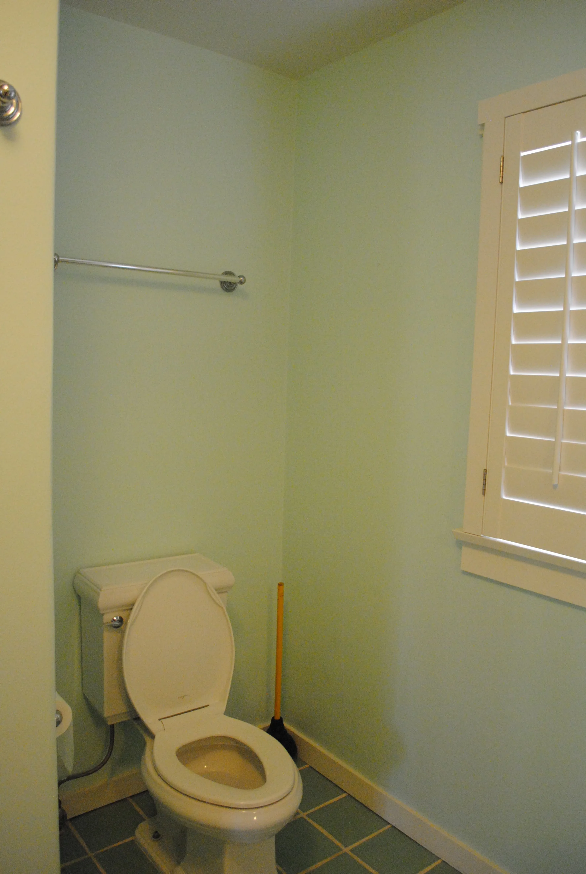
Before Images
The homeowners wanted a very neutral color palette with no dramatic colors or patterns. So I began by selecting a driftwood finish vanity paired with grey and white tiles, soft silver lighting fixtures, brushed nickel plumbing and elegant glass apothecary jars to hold some bathroom essentials that would double as decor. This simple design was elegant, yet serene and just what they wanted. With a plan in hand we hit the ground running.

Demo day is always fun, exciting and scary all at once. You never know what you’re going to find when you start tearing things up. We discovered that the electrical

The challenge was finding a ready-made vanity that would fit the entire length of the wall - 112” to be exact. Almost impossible. So I designed and drew a custom vanity and took my drawings to a local craftsman to fabricate. The vanity provides a ton of open storage for pretty little things and deep drawers to store the not so pretty things. The over-sized mirror was in perfect condition so we saved money by leaving it in. We did refinished the frame to match though.

By removing the overhead soffit we were able to place the sconces a little higher up which made a huge difference! We painted the walls in a warm taupey/grey, installed all new lighting and plumbing including a new toilet, kept the white wooden shutters and even re-used the existing glass shower surround!

The once colorful and eclectic bathroom, finally found it’s softer and quieter side! Now, tell me. How would you feel being a guest in this house? Relaxed? Peaceful? Pampered? All of the above for me!

Check out these dramatic before and afters.


Hope you enjoyed!
Up next in this San Roque Beauty…The master bedroom.
xo,