A Gloomy Living Space Is Updated to Elegant And Fresh
So as it often happens, you move into a new home and you don’t know where or how to make the old furniture work in the new space. That was the problem in this cozy San Roque home. While we were renovating the kitchen and all the bathrooms in this home, the formal living and dining room didn’t need too much construction work (except for the fireplace wall) so they came together relatively quickly.
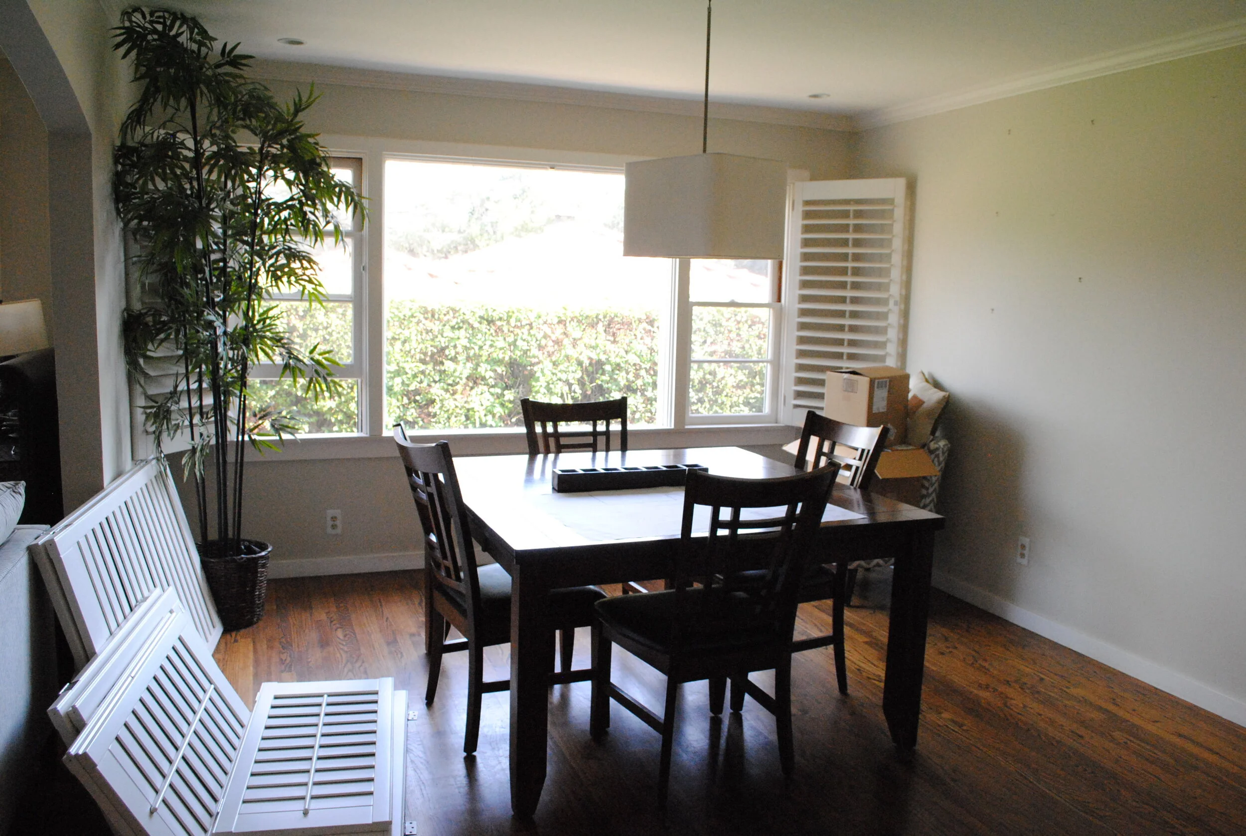
Some of the challenges we had were that the windows had wooden shutters throughout and while the wife liked them, the husband absolutely did not. He began to take them down as you can see in one of the ‘before” images below, but after some negotiating between the two spouses, we ultimately decided to leave them in place.
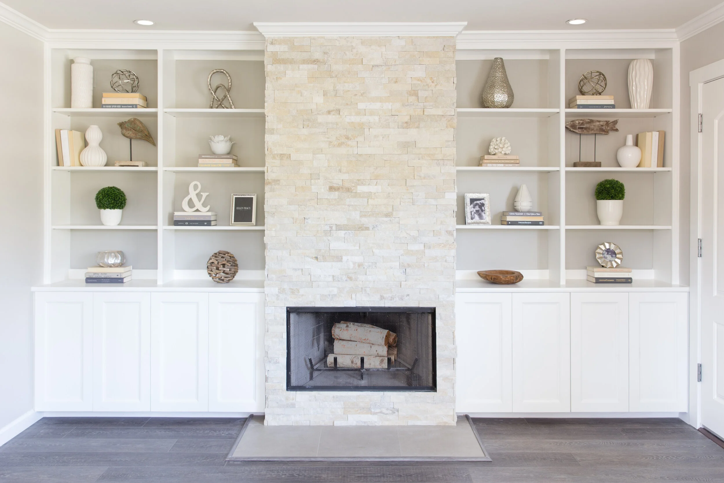
We went back and forth on what to do with this built in system. It provided ample storage and a good place to display pretty little things but the couple couldn’t decide if they wanted to keep the bookshelves or have a clean wall instead where they could display some artwork.
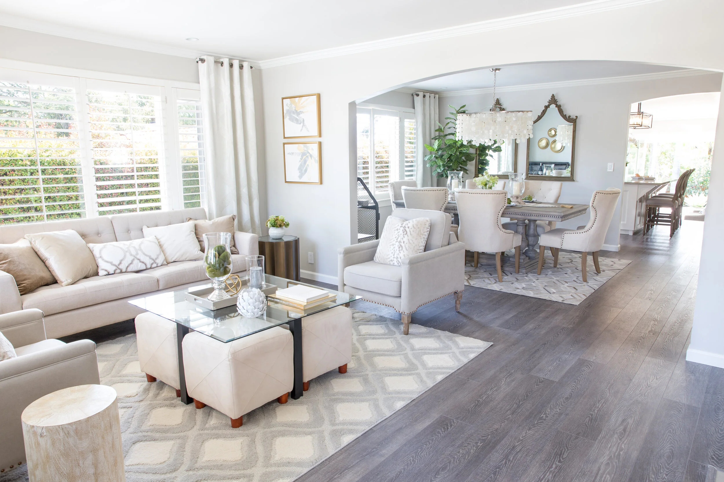
So the design plan was pretty straight forward. Let’s keep it neutral, simple and elegant. Let’s play with the natural light in this room and bring in warm driftwood tones and natural elements like capiz shells and botanicals, sprinkle a little gold here and there and bam! Enjoy a grown up space.
In fact, those were the exact words from my client “I feel so grown up sitting here!”.
We saved a little bit of money by using a sofa they had in another room and using their existing coffee table that they were very fond of.
The capiz shell chandelier was definitely a striking addition in this small dining room but my favorite piece is the cow hide rug! And, notice we decided to put back those wooden shutters because after all they did provide privacy but also because they added an extra layer of texture and dimension to this whole space since we didn’t have too many colors or patterns to work with.
In the end, we decided to keep the beautiful built-in cabinets flanking the fireplace. We eliminated some of the shelves, painted the back wall a light grey, refinished the fireplace facade, and added a wood trim to the cabinet doors to make them a little more interesting. We also added some fun knobs (not seen here).
Doesn’t this space look so much brighter and fresher? It is a cool grown up place to hang out and read a book and enjoy some peace and quite!
XX


