
Before & After: Interior Design in Westlake Austin (Lost Creek Home)
Before and after interior design project in Lost Creek, Westlake Austin. See how we transformed a family home into a cohesive, elevated, and livable space.
A Westlake Family Home Designed for Real Life
Located in the Lost Creek neighborhood of Westlake Austin, the Vista Verde project began with a home that already had character—but lacked a sense of cohesion and personality.
Our clients, a young family with two daughters, had recently moved into a larger home with the intention of settling in long-term. While the house had been updated by previous owners, it didn’t yet feel like theirs.
They wanted a home that could do both:
feel relaxed and functional for everyday family life
feel elevated and ready for entertaining
That balance became the foundation of the entire design.

“BEFORE” IMAGE OF OUR VISTA VERDE PROJECT - WESTLAKE AUSTIN, TX.
The Challenge: A Home That Felt “Almost There”
Like many homes in Westlake and Lost Creek, this one had great bones—but the details didn’t fully connect.
The space felt:
slightly unfinished
lacking warmth and layering
not fully aligned with the family’s lifestyle
Although updates had already been made, the home needed a more intentional approach—one that would refine what was there and elevate it into something cohesive and personal. View more details of the “before” conditions of this project HERE.
The Vision: Casual, Elevated, and Designed for Living
From the beginning, the goal was clear:
Create a home that feels:
modern but not cold
refined but still comfortable
family-friendly without sacrificing style
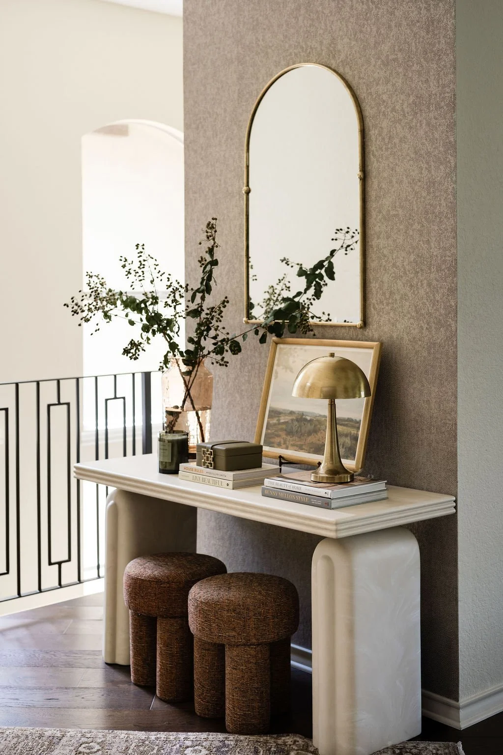
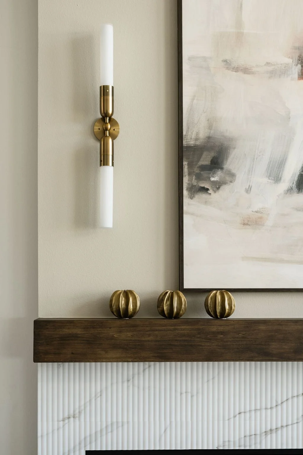
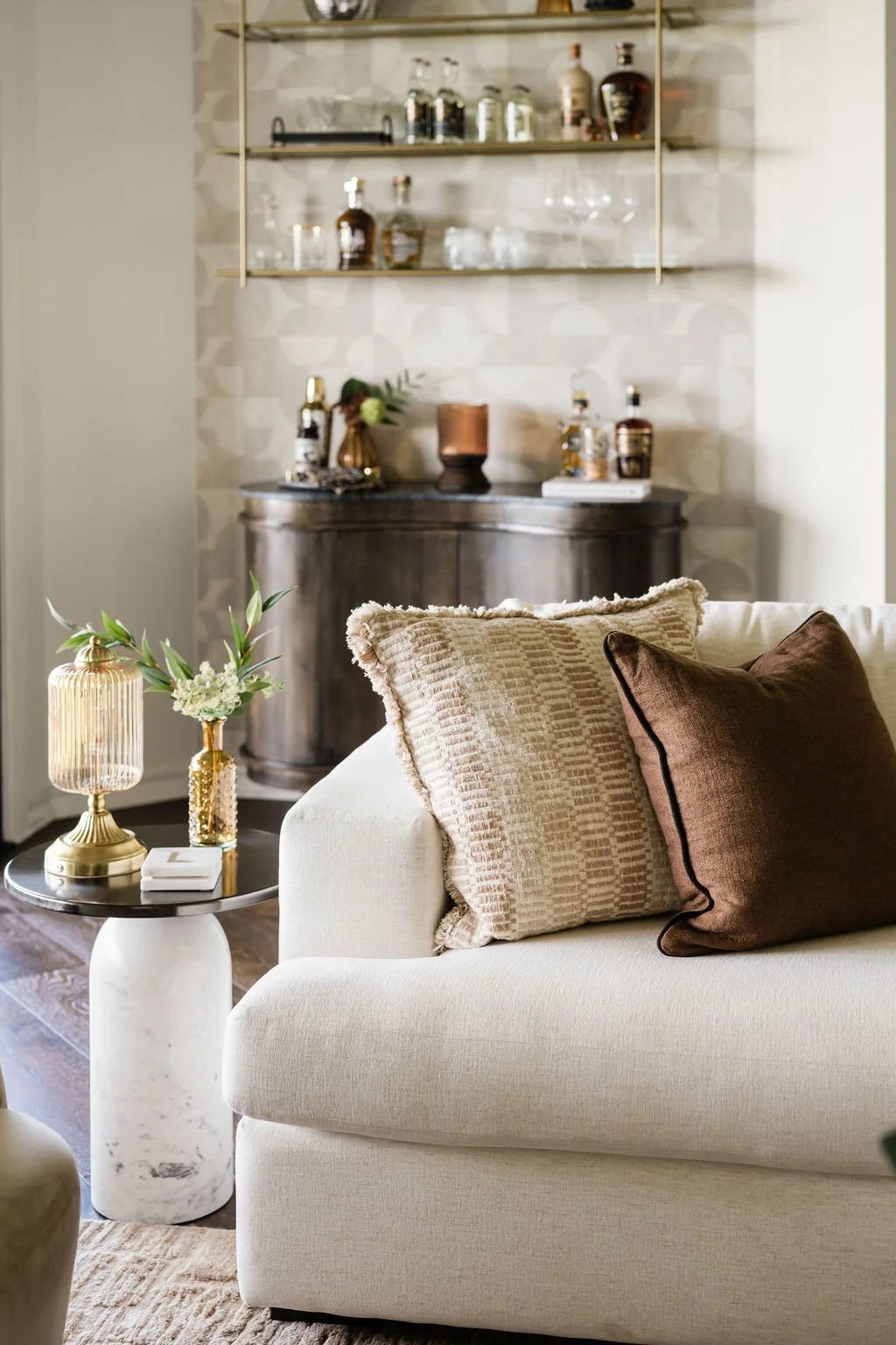
We leaned into a modern organic direction, layering:
warm textures
natural materials
clean, modern silhouettes
The result is a home that feels grounded, inviting, and distinctly personal—never overly styled or rigid.

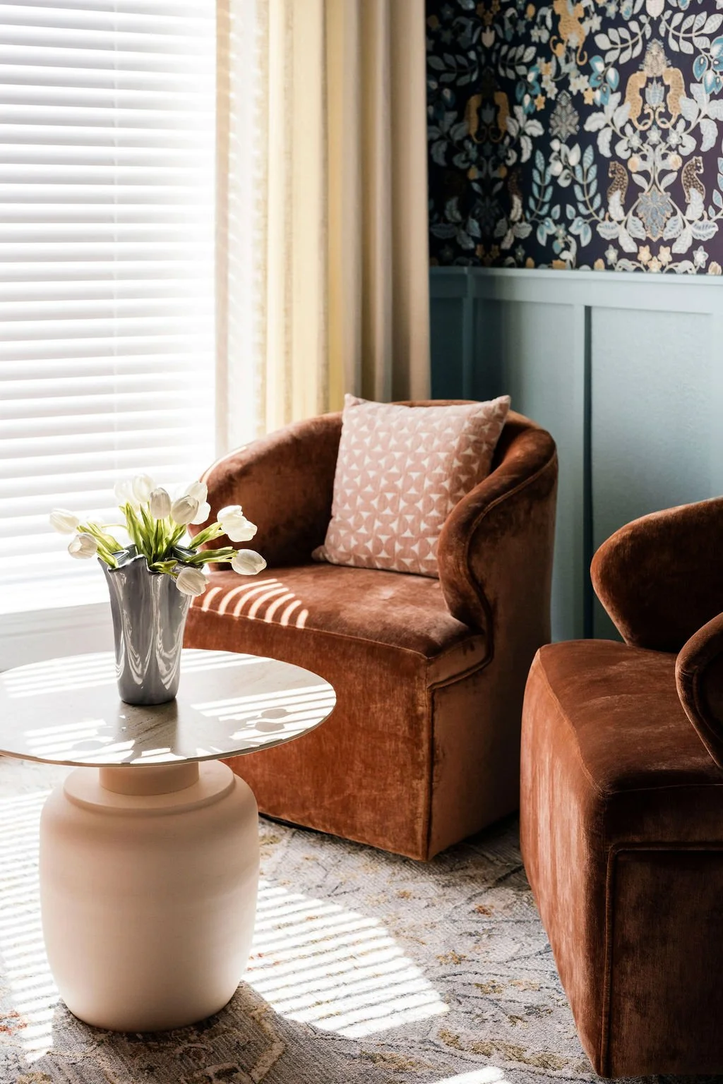
“AFTER” IMAGE OF OUR VISTA VERDE PROJECT IN WESTLAKE, AUSTIN TX.
Creating Zones for How the Family Lives
One of the most important shifts in this project was creating intentional zones throughout the home.
Instead of designing one continuous space, we focused on how the family actually lives day-to-day.
We introduced:
a dedicated kids’ retreat for play and creativity separate from the main living areas
refined main living areas for entertaining
layered spaces that could transition easily between casual and elevated
This allowed the home to function effortlessly—whether it was a quiet evening at home or hosting friends.
The Design Approach: Refining, Not Rebuilding
Rather than starting from scratch, this project was about taking what existed and elevating it thoughtfully.
Key updates included:
Custom millwork and built-ins to add architectural interest
Accent paint and wallpaper to bring depth and personality
Updated lighting throughout the home
New hardware and finishes for a more cohesive look
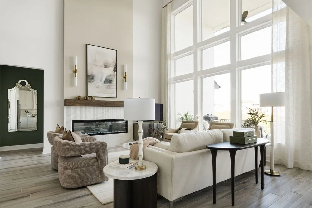
One of the most impactful changes was enhancing the home’s connection to natural light, including architectural elements that opened up the living areas and made the space feel brighter and more expansive. The updated black metal windows and doors in the great room truly transformed this space!
Furnishings That Feel Collected, Not Overdone
Once the foundation was in place, we layered in furnishings and styling that brought the home to life.
We focused on:
comfortable, livable upholstery
a mix of modern and organic pieces
subtle contrast through materials and tone
pieces that feel curated rather than matched
Every element was selected to support both function and aesthetic—nothing felt excessive, but everything felt intentional.

The Result: A Home That Finally Feels Complete
The transformation of this home wasn’t about dramatic structural changes—it was about clarity, cohesion, and thoughtful layering.
Now, the home feels:
light-filled and welcoming
functional for everyday life
elevated enough for entertaining
deeply personal to the family living in it
It’s a space where children can grow, parents can unwind, and guests feel instantly at ease.

Great room design of our Lost Creek project in Westlake, Austin TX.
Why This Matters for Westlake Homeowners
Many homes in Westlake and Lost Creek share a similar story:
They have strong architectural foundations but need refinement to feel complete.
If your home feels:
almost finished, but not quite there
disconnected from your style
difficult to pull together on your own
You’re not alone—and this is exactly where thoughtful interior design makes the biggest difference.
Thinking About Updating Your Home?
Whether you’re furnishing a new home, finishing a remodel, or simply trying to make your space feel more cohesive, having a clear plan changes everything.
A consultation is often the best place to begin—especially if you’re not sure what your next step should be.
Interior Design in Austin, TX: Creating a Home That Feels Effortless and Well-Lived
Designing a home should feel exciting—not overwhelming. But for many homeowners in Austin, the process quickly becomes more complicated than expected.
Between managing selections, coordinating vendors, making layout decisions, and trying to pull everything together cohesively, it’s easy to feel stuck or unsure of where to begin.
This is where working with an interior designer can completely change the experience.
What Interior Design Really Means (Beyond Aesthetics)
Interior design is often misunderstood as simply choosing furniture or making a space look beautiful. In reality, it’s about creating a home that works well for your daily life—functionally, visually, and emotionally.
In Austin, where homes range from Hill Country estates to modern new builds and renovated family homes, thoughtful design means:
Understanding how the space is actually used day to day
Creating layouts that feel intuitive and comfortable
Selecting materials and finishes that hold up over time
Designing with both beauty and livability in mind
A well-designed home doesn’t just look good—it feels easy to live in.
The Austin Lifestyle and How It Shapes Design
Design in Austin has its own rhythm. Homes here are often centered around:
Open-concept living for entertaining
Indoor-outdoor connections
Natural light and layered textures
A balance of relaxed and refined
Rather than chasing trends, most homeowners are looking for spaces that feel calm, grounded, and personal.
That’s why we focus on creating interiors that feel timeless, comfortable, and effortlessly elevated—spaces that support both everyday living and hosting family and friends.
When It Makes Sense to Hire an Interior Designer
Many clients reach out after realizing that managing everything on their own is more time-consuming and stressful than expected.
You might benefit from working with an interior designer if:
You’re furnishing a new home and don’t know where to start
You’re finishing a remodel and want everything to come together cohesively
You’ve made a few purchases already, but something still feels “off”
You don’t have time to manage all the details yourself
You want the home to feel complete—not pieced together
What Full-Service Interior Design Looks Like
For busy homeowners, full-service interior design is often the most efficient and least stressful option.
This typically includes:
Space planning and layout design
Furniture, materials, and finish selections
Sourcing and procurement
Coordination with vendors and trades
Delivery, installation, and final styling
Instead of juggling multiple decisions and timelines, you have a clear plan and a single point of contact guiding the process from start to finish.
Why the Process Matters More Than You Think
One of the biggest differences between a well-designed home and a frustrating experience is having a clear, structured process.
Without it, projects often run into:
delays
mismatched finishes
furniture that doesn’t fit
unnecessary re-spending
With the right guidance, those issues are avoided before they happen.
Creating a Home That Feels Finished

A common challenge we see is homes that feel almost complete—but not quite there.
This usually happens when:
pieces are selected individually instead of as a whole
scale and proportion aren’t fully considered
the final layers (lighting, textiles, styling) are missing
Interior design brings everything together so the home feels cohesive, intentional, and fully resolved.
Final Thoughts
Interior design in Austin is not about creating something overly styled or untouchable. It’s about creating a home that feels natural, functional, and reflective of how you actually live.
When done well, the process should feel clear, guided, and ultimately enjoyable—not overwhelming.
If you’re thinking about updating your home, furnishing a new space, or finishing a remodel, working with a designer can help you move forward with clarity and confidence.
A consultation is often the best place to begin.

If you’re searching for a luxury interior design studio in Austin, TX that delivers refined spaces with minimal stress, we’re here to help.
From concept to completion — we handle it all. Book your free discovery call here, and let’s make your dream space a reality.
Interior Design Services in Austin: Flexible Design Support with a Luxury Touch
Great design doesn’t always require a full-scale commitment — sometimes, it simply requires the right expertise at the right time.
At Claudia Pakes Design Studio, our A-la-carte interior design services in Austin are designed for homeowners who want professional guidance without the scope of a full home project. These services offer flexibility, clarity, and elevated design direction — perfect for busy professionals, growing families, and design-savvy clients who want expert input without overwhelm.
What Makes A-la-Carte Interior Design Different?

A-la-carte interior design allows you to work with a professional designer on specific design needs, rather than an all-inclusive package. You choose the services that matter most to your project — whether that’s refining a layout, selecting finishes, or completing the final details.
You still receive the same thoughtful design process and attention to detail — just tailored to your priorities.
Our A-la-Carte Interior Design Services in Austin:
Design Consultation
Our design consultation is often the starting point. This session provides professional insight into your space, layout recommendations, aesthetic direction, and next steps. It’s ideal for clients who want clarity before moving forward or need guidance to make confident decisions.
Space Planning & Furniture Layout
A well-planned layout is the foundation of a functional home. We help define furniture placement, traffic flow, and spatial balance to ensure your home feels intentional, comfortable, and visually cohesive.
Color, Finish & Material Selection
Selecting paint colors, flooring, tile, countertops, and finishes can quickly become overwhelming. We curate cohesive palettes that reflect your style while ensuring everything works together seamlessly — now and long-term.
Furniture & Decor Selection
From key furniture pieces to decorative accents, we help source items that elevate your space while supporting everyday living. Each recommendation is chosen with scale, comfort, and longevity in mind.
Lighting Design Guidance
Lighting has the power to transform how a space feels. We provide guidance on fixture styles, placement, and layered lighting strategies that enhance both function and ambiance throughout your home.
Kitchen & Bathroom Design Support
For clients working with contractors or builders, this service provides professional design direction for kitchens and bathrooms. We assist with layout refinement, cabinetry style, finish selections, hardware, and overall cohesion — helping you avoid costly mistakes.
Custom Window Treatments
Window treatments are a critical design element that often gets overlooked. We guide you through fabric selection, styles, functionality, and hardware options to ensure your window treatments feel tailored and fully integrated into your design.
Finishing Touches & Styling
The final details make all the difference. This service focuses on art placement, accessories, textiles, and styling elements that bring warmth, balance, and polish to your home — perfect for spaces that feel almost complete.

Virtual Interior Design
For added flexibility, our virtual interior design services allow you to receive expert guidance remotely. You’ll receive clear design direction, curated selections, and actionable plans — ideal for clients with busy schedules or homes outside the Austin area.
Who Benefits Most from A-la-Carte Interior Design?
Homeowners updating specific rooms
Busy professionals managing projects independently
Clients working with contractors or builders
Design-savvy homeowners seeking expert validation
Those who want luxury design guidance without full-service scope
A Thoughtful, Stress-Free Design Experience
Our A-la-carte interior design services are built on the same philosophy as our full-service work: thoughtful design, seamless guidance, and a stress-free experience. We help you make confident decisions, avoid costly errors, and achieve a cohesive look — without unnecessary complexity.
Design Support, On Your Terms
With A-la-carte interior design services in Austin, you don’t have to choose between professional expertise and flexibility. You can have both.
Whether you’re refining one space or finalizing the details of your home, we’re here to guide you every step of the way.
Ready to Begin?
If you’re looking for flexible, high-end interior design services in Austin, our A-la-carte options are an ideal place to start.
A-la-Carte Interior Design Services in Austin: Expert Design, Your Way

Not every home needs a full renovation — sometimes, you just need expert guidance at the right moment.
At Claudia Pakes Design Studio, our A-la-carte interior design services in Austin are created for homeowners and busy professionals who want high-end design support without committing to a full-scale project. Whether you're refreshing one room, selecting finishes, or need professional direction before making decisions, our flexible services deliver clarity, confidence, and elevated results.
What Are A-la-Carte Interior Design Services?
A-la-carte interior design allows you to select only the services you need, when you need them. It’s ideal for clients who value professional expertise but prefer a more hands-on or phased approach.
You receive the same thoughtful design, attention to detail, and refined aesthetic — just tailored to a specific scope.
Our A-la-Carte Interior Design Services in Austin
Space Planning & Layout Design
Perfect for new homes, remodels, or tricky layouts. We help you optimize flow, functionality, and furniture placement so every square foot works beautifully.
Color & Material Selection
Choosing paint colors, tiles, countertops, or flooring can feel overwhelming. We curate cohesive palettes that align with your home’s architecture and your lifestyle.
Furniture & Decor Selection
From statement pieces to finishing touches, we guide you toward furniture and decor that elevate your space while staying practical for everyday living.
Lighting Design Guidance
Lighting can completely transform a room. We help you select fixtures, layering strategies, and placements that enhance mood and functionality.

Kitchen & Bathroom Design Support
Ideal for clients working with contractors but needing professional design direction — cabinetry layouts, finishes, hardware, and styling guidance included.
Custom Window Treatments

Window treatments play a key role in how a space looks and feels. We provide expert guidance on fabric selection, styles, hardware, and functionality to ensure your window treatments are tailored, cohesive, and thoughtfully integrated into the overall design.
Finishing Touches & Styling
The final layer is what brings a space together. This service focuses on art placement, accessories, textiles, and styling details that complete the design and give your home a polished, intentional look.
Virtual Interior Design (Austin & Beyond)
For clients who want flexibility, our virtual services provide detailed design plans, shopping lists, and visual guidance — all from the comfort of your home.
Who Are A-la-Carte Services Best For?
Busy professionals managing projects independently
Homeowners updating one room or specific elements
Clients working with builders or contractors
Design-savvy homeowners seeking expert validation
Austin homeowners wanting premium design without full service
Why Choose Our A-la-Carte Interior Design Services in Austin?
Luxury-level expertise without overcommitting
Flexible, stress-free design support
Personalized solutions — no generic templates
Thoughtful design rooted in function and elegance
A seamless experience, even for smaller projects
We bring clarity to your decisions, helping you avoid costly mistakes while achieving a cohesive, elevated look.

A Smarter Way to Design Your Home
Design doesn’t have to be all or nothing. With A-la-carte interior design services in Austin, you get professional guidance exactly where it matters most — making the process easier, faster, and far more enjoyable.
Whether you need help selecting finishes, refining layouts, or completing the final details, we’re here to support you with expertise and ease.
Ready to Get Started?
If you’re looking for flexible, high-end interior design services in Austin, our A-la-carte options are the perfect place to begin.
Maximize Your Space: Clever Room Makeover Solutions for Small Spaces
Small spaces deserve just as much intention as large ones. With thoughtful planning and the right design approach, even the most compact room can feel open, functional, and beautifully balanced.
Designing a small room isn’t about adding more — it’s about making smarter choices that allow every inch to work harder.
Understanding the Small Space Challenge
Small rooms come with unique constraints. Limited square footage, tight layouts, and insufficient storage can easily make a space feel crowded. Without a cohesive plan, clutter becomes visible quickly, and functionality is compromised.
The solution lies in intentional design — layouts that prioritize flow, furniture that serves multiple purposes, and finishes that visually expand the space.
Light Colors and Reflective Surfaces
A light, neutral color palette instantly makes a room feel more expansive. Soft whites, warm beiges, and subtle greys reflect natural light and create a calm, airy foundation. Personality can be layered in through art, textiles, and curated accessories without overwhelming the space.
Mirrors are especially effective in small rooms. When placed strategically, they reflect light, add depth, and visually double the size of the space. A large mirror opposite a window or mirrored closet panels can dramatically enhance openness.
Multi-Functional Furniture That Works Smarter
In a compact room, every piece should earn its place. Multi-functional furniture is essential for maximizing usability without sacrificing aesthetics.
Consider beds with built-in storage, ottomans that double as seating and storage, or coffee tables that convert into work surfaces. Wall-mounted desks, nesting tables, and Murphy beds offer flexibility while keeping the room visually light and uncluttered.
Vertical Storage Solutions
When floor space is limited, vertical space becomes invaluable. Floor-to-ceiling shelving draws the eye upward and increases storage without crowding the room. Floating shelves, wall-mounted cabinets, and tall storage provide functionality while maintaining an open feel.

In kitchens and workspaces, hanging rails, pegboards, and magnetic strips keep essentials accessible and organized — freeing up drawers and countertops.
Thoughtful Layout and Flow
A well-planned layout can completely transform how a small room feels. Start by identifying the room’s focal point and arrange furniture to enhance, not obstruct, it. Clear pathways are essential for comfort and visual ease.
Leaving slight breathing room between furniture and walls can actually make a space feel larger. Creating defined zones — rather than lining furniture along walls — adds structure and purpose without clutter.
Declutter With Intention
Clutter quickly overwhelms small spaces. A successful room makeover begins with editing what you own and creating dedicated storage for everything that remains.
Smart organization systems, hidden storage, and drawer dividers help maintain order behind the scenes. Adopting a mindful approach to new purchases ensures the space remains calm, functional, and easy to maintain.
Layered Lighting for a Spacious Feel
Lighting plays a critical role in how large a room feels. Layer ambient, task, and accent lighting to eliminate shadows and dark corners. Wall sconces and pendant lights free up surface space while adding visual interest.
Natural light should always be prioritized. Sheer curtains or minimal window treatments allow light to flow freely, enhancing openness and connection to the outdoors.
Adding Personality Without Overcrowding
Small spaces can still reflect personal style — the key is restraint. Choose a few impactful elements rather than many small accessories. A statement artwork, a textured rug, or a sculptural light fixture can anchor the room beautifully.
Conclusion
Designing a small room is about intention, not limitation. With smart layouts, multi-functional furniture, and a carefully curated aesthetic, compact spaces can feel just as refined and comfortable as larger homes.
At Claudia Pakes Design Studio, we believe great design is measured by how a space supports your lifestyle. Whether it’s a full-room transformation or a strategic refresh, our end-to-end interior design approach ensures every space — no matter the size — feels effortless, functional, and beautifully considered.
Let’s create a space that tells your story (beautifully and quietly).
Our full-service design experience takes care of every detail, from concept to install. Book your free discovery call here, and let’s make your dream space a reality.
Transform Your Culinary Space: The Ultimate Guide to Kitchen Interior Design in Austin
A kitchen designed for the way you live today — effortless, functional, and beautifully connected to Austin’s unique character.
Why Austin Homeowners Are Investing in Kitchen Redesigns
Austin’s vibrant lifestyle, thriving food culture, and evolving housing market have made the kitchen the most important room in the home. Today, it’s more than a cooking space — it’s where families gather, work happens, and guests are entertained.
Whether you’re updating a historic Hyde Park bungalow or a modern residence in West Lake Hills, a professionally designed kitchen can dramatically elevate daily living.
What Professional Designers Bring to the Table
A skilled kitchen designer helps you:
Navigate spatial limitations
Optimize workflow and functionality
Select durable materials suited for Texas weather
Avoid costly renovation mistakes
Access trusted contractors and locally sourced materials
Their expertise saves time, reduces stress, and ensures your investment delivers long-term value.

Current Trends Shaping Austin’s Culinary Spaces
Austin’s design style blends natural materials, local craftsmanship, and warm modern aesthetics.
1. Natural & Local Materials
From locally sourced limestone countertops to reclaimed Texas wood and artisan handmade tiles, natural textures are defining Austin kitchens. These choices feel authentic, timeless, and beautifully connected to the Hill Country landscape.
2. Open Layouts with Purposeful Zoning
Open-concept kitchens remain in demand, but with clearer boundaries for:
Cooking
Dining
Socializing
Multi-functional islands often act as prep space, breakfast seating, and workstations all in one.
3. Smart & Space-Saving Storage
Older Austin homes often have limited square footage, making efficient storage essential. Popular additions include:
Pull-out shelves
Vertical cabinetry
Walk-in pantries
Built-in organizers
4. Color Palettes Inspired by Texas Landscapes
Warm terracotta, sage green, dusty blue, and muted neutrals echo Austin’s sunsets and nature. Bold geometric backsplashes or hand-painted tiles add personalization without overpowering the space.
Essential Elements of Functional Kitchen Design
A beautiful kitchen must also work seamlessly for your lifestyle.

The Updated Work Triangle
Modern kitchens adapt the classic refrigerator–sink–stove triangle to suit:
Larger appliances
Multiple cooks
Different cooking zones
Thoughtful Lighting Layers
Effective lighting completely transforms a kitchen. Designers use:
Ambient lighting
Task lighting
Accent lighting
Natural light is emphasized wherever possible, improving mood and reducing energy usage.
Smarter Storage Planning
Exceptional kitchens are not just well-designed — they’re well-organized. Custom cabinetry, drawer dividers, pull-outs, and thoughtfully designed pantries ensure everything has a place.
Sustainability Meets Style in Austin Kitchens
Austin’s eco-conscious mindset deeply influences design choices.
Sustainable Elements Gaining Popularity
Energy-efficient appliances
LED lighting
Low-flow faucets
Programmable thermostats
Design materials also lean green:
Recycled glass countertops
Bamboo cabinetry
Low-VOC paints
Many designers also partner with local salvage yards to reuse architectural elements that add character.
The Value of Hiring a Professional Kitchen Designer
Managing a major renovation alone often leads to:
Poor electrical planning
Inadequate ventilation
Awkward layouts
Budget overruns
A professional designer streamlines the entire process — from concept to completion — ensuring your kitchen is both beautiful and highly functional.
A Design Investment That Pays Off
A well-designed kitchen can recoup 60–80% of renovation costs at resale. More importantly, it improves the way you cook, host, and live every single day.
How to Begin Your Kitchen Transformation
1. Clarify Your Vision
Create mood boards and define what you love — colors, styles, and must-have features.
2. Identify Pain Points
Note issues in your current kitchen such as:
Low storage
Poor lighting
Inefficient layout
These insights help designers deliver solutions that truly improve your life.
3. Set a Realistic Budget
Include a 10–15% contingency for unexpected construction findings. Explore renovation financing options if needed.
4. Choose the Right Designer
Review portfolios, check references, and schedule consultations. Look for designers who understand Austin’s architecture, climate, and lifestyle.
Conclusion
A well-designed kitchen becomes the heart of your home — a place where meals, conversations, and memories come together effortlessly. Austin’s diverse architecture and rich design culture offer endless possibilities for creating a space that reflects your style while supporting your everyday routines.
When you’re ready to begin your transformation, Claudia Pakes provides a full-service, white-glove design experience tailored to your lifestyle. Book your free discovery call here, and let’s make your dream space a reality.

Custom Bathroom Design in Austin: Your Complete Interior Design Guide
Even the smallest bathroom can feel spacious, refined, and functional with the right design approach. Explore how thoughtful planning, smart storage, and elevated materials can transform your Austin bathroom into a serene, modern retreat.
Your bathroom is more than a functional space — it’s your personal sanctuary, a spa-like retreat where each day begins and ends. In Austin, where homes blend Hill Country warmth with contemporary sophistication, custom bathroom design has become essential for creating spaces that reflect both personal style and everyday lifestyle needs.
Whether you’re envisioning a luxurious master suite with a freestanding soaking tub, a sleek modern powder room, or a family-friendly bathroom that balances beauty with durability, custom design transforms ordinary rooms into extraordinary experiences. This guide walks you through everything you need to know about designing a bathroom that elevates your home and enhances your daily routine.
Custom Bathroom Design vs. Standard Renovations
What truly separates custom bathroom design from a standard remodel?
PERSONALIZATION, INTENTION, AND EXPERT GUIDANCE.
A typical renovation focuses on cosmetic updates or replacing fixtures with off-the-shelf options. Custom Bathroom Design in Austin, however, takes a holistic, lifestyle-driven approach. A designer evaluates how you use the space — from your morning rhythm to your evening wind-down — and creates a room that supports your habits, preferences, and long-term needs.
Every element is chosen with purpose:
Finishes that complement your home’s architecture
Lighting that creates the right mood at the right time
Storage that eliminates visual clutter
Layout that maximizes both flow and function
Custom design tells a cohesive, personal story — one that feels effortlessly yours.
Key Elements of Exceptional Bathroom Design
LAYOUT & SPACE PLANNING
A beautiful bathroom begins with thoughtful space planning. Even the most luxurious finishes can’t compensate for a layout that feels cramped or inefficient.
In Austin homes — from cozy bungalows to expansive Hill Country estates — space planning plays a critical role. Skilled designers maximize every square inch through strategic fixture placement, clever storage, and visual techniques that create a sense of spaciousness and calm.
Material Selection & Finishes
Materials shape both the aesthetic and the longevity of your bathroom.
Natural stone, porcelain, quartz, and custom cabinetry create distinctive looks while standing up to Austin’s humidity. Mixing textures — such as marble counters with textured tile or warm wood with cool metals — adds depth and dimension without overwhelming the senses.
Lighting Design
Lighting is one of the most transformative design elements.
A layered approach ensures functionality and ambiance:
Task lighting for grooming
Ambient lighting for overall illumination
Accent lighting to highlight architectural details
Natural light is always a bonus. Strategically placed windows or skylights bring in the Texas sun while preserving privacy. For windowless spaces, designers use reflective surfaces and warm, balanced fixtures to mimic daylight.
Storage Solutions
A serene bathroom requires thoughtful storage.
Custom solutions — floating vanities, recessed niches, lit medicine cabinets, and organized linen storage — keep essentials accessible yet out of sight. Designers tailor storage to your real, daily needs, creating harmony and order.
Austin-Specific Design Considerations
Inspired by Hill Country Aesthetics
Austin design often blends natural materials and organic textures that echo the local landscape — limestone, warm woods, earthy hues. These elements create spaces that feel grounded, warm, and timeless.
Climate & Durability
Austin’s heat and humidity make durability essential.
Porcelain tile, engineered stone, moisture-resistant cabinetry, and proper ventilation all ensure longevity.
Sustainability & Water Conservation
Eco-conscious design is increasingly important in Austin. Low-flow fixtures and smart water-saving technologies reduce usage without sacrificing experience.
Popular Bathroom Styles in Austin
Modern Minimalism – Clean lines, floating vanities, frameless glass, refined simplicity
Contemporary Farmhouse – Rustic charm with modern comforts and warm materials
Transitional Elegance – A blend of classic beauty and modern functionality
Spa-Inspired Luxury – Soothing palettes, natural materials, soaking tubs, and wellness features
The Custom Bathroom Design Process
● Initial Consultation & Vision Development
A conversation to understand your habits, frustrations, goals, and aesthetic preferences.
● Space Assessment & Measurement
Evaluating layout, plumbing, electrical, and structural elements to determine what’s possible.
● Concept Development & Presentation
Mood boards, 3D renderings, and material palettes help you visualize the space before construction.
● Material Selection & Procurement
Designers source elevated, high-quality materials — often from trade-only vendors.
● Project Management & Installation
Coordinating contractors, timelines, deliveries, and quality control ensures a seamless experience from start to finish.
Budgeting for Your Custom Bathroom
Custom design accommodates a range of budgets through thoughtful prioritization.
Investing in high-impact elements — quality fixtures, durable surfaces, and proper lighting — ensures long-term value.
Professional guidance helps you avoid costly mistakes, secure better pricing, and ensure that every detail is executed correctly.
Common Design Mistakes to Avoid
Insufficient lighting
Limited storage
Poor ventilation
Overly trendy selections
Incorrectly sized fixtures
Designers help you avoid these pitfalls while keeping the space functional and timeless.
Conclusion: Creating Your Dream Bathroom
A custom-designed bathroom elevates your daily life and enhances your home’s value. In Austin’s competitive market, thoughtful design stands out — and provides immediate comfort and long-term beauty.
At Claudia Pakes Design Studio, we specialize in creating refined, functional bathrooms with complete design and renovation support. From concept to completion, we handle every detail with care, integrity, and an unwavering commitment to exceptional design.

Bathroom Remodeling Austin: Creative Ideas for Small Bathrooms
Discover how modern layouts, elevated materials, and expert planning can transform even the smallest Austin bathroom into a beautifully functional retreat.
Beautifully designed, effortlessly delivered.
Small bathrooms may feel limiting at first glance, but with thoughtful design, they can become some of the most charming and functional spaces in your home. For many Austin homeowners—especially busy professionals—small bathroom remodels are an opportunity to elevate daily routines with comfort, ease, and timeless style.
At Claudia Pakes Design Studio, we believe even compact spaces deserve a high-end, cohesive design that feels intentional from the very first concept to the final installation.

Maximize Space with a Thoughtfully Planned Layout
In a small bathroom, every inch matters. A well-planned layout not only improves flow but also creates a sense of calm and clarity—something busy homeowners truly appreciate.
Strategic updates such as:
shifting fixtures for better movement,
opting for a pocket door, or
choosing a floating vanity
can instantly open up the room. With professional space planning, you get a layout that feels effortless, safe, and visually balanced, while still supporting your daily routines.
Create Airiness with Light Colors & Reflective Surfaces
Light, airy palettes work beautifully in small bathrooms. Soft whites, warm neutrals, and gentle blues or greens help the space feel fresh and open.
Reflective materials—glass, polished tile, metallic touches—carry light throughout the room, making it feel brighter and more expansive. These finishes pair naturally with Austin’s warm climate and the city’s love for clean, modern interiors.
Choose Streamlined, Space-Saving Fixtures
Compact, beautifully designed fixtures can transform how a small bathroom feels and functions. Wall-mounted toilets, slim vanities, and frameless glass showers eliminate visual clutter and bring a contemporary sense of openness.
These design decisions make everyday use feel lighter, easier, and far more enjoyable—perfect for homeowners seeking a refined yet functional look.

Integrate Smart Storage for a Clutter-Free Space
Clutter quickly overwhelms a small bathroom. Smart, integrated storage keeps the room feeling serene and organized.
We often incorporate:
recessed shower niches,
tall custom cabinets,
floating shelving, and
well-planned under-sink storage
to ensure every item has a thoughtful place. Custom storage solutions are especially effective in Austin homes, where unique layouts benefit from tailored design.
Use Modern, Layered Lighting to Enhance the Room
Good lighting changes everything, especially in compact bathrooms. A layered approach—ambient, task, and subtle accent lighting—creates openness and warmth.
Elements like LED backlit mirrors, recessed lighting, and elegant sconces brighten the space without overwhelming it. When lighting is done well, materials look richer, colors feel true, and the overall space feels welcoming and elevated.
Elevate the Design with High-Impact Materials
Because small bathrooms require fewer materials, it’s the perfect opportunity to indulge in premium finishes. Quartz counters, marble-look porcelain, handcrafted tiles, and warm wood elements add personality and a touch of luxury.
A patterned floor, textured tile wall, or thoughtfully chosen statement surface can create the refined, modern look many Austin homeowners love—without stretching the renovation budget.
Upgrade the Shower for an Open, Modern Feel
A beautifully designed shower can instantly modernize a small bathroom. Curbless showers bring a sleek, seamless feel, while clear glass enclosures remove unnecessary visual barriers.
Large-format tiles minimize grout lines, creating an uninterrupted, expansive look. Replacing a traditional tub with a spacious walk-in shower is one of the most effective ways to add comfort, accessibility, and visual openness.
Add Personality Through Thoughtful Decor
Even the smallest spaces can reflect your personal style. Minimalist accessories, warm metallic hardware, simple trays, and sculptural planters can add character without overwhelming the room.
The goal is always the same: a clean, cohesive space that feels refreshing, intentional, and beautiful.

Why Work with a Professional Designer in Austin
Designing a small bathroom requires creativity, precision, and a clear understanding of how to make a compact space feel both elegant and functional. A professional designer brings together layout strategy, material curation, lighting, and custom detailing—delivering a final result that feels effortless for the homeowner.
Claudia Pakes Design Studio specializes in creating spaces that blend aesthetics with everyday ease. From the initial concept to procurement and installation, we handle every detail so you can enjoy a smooth, stress-free remodeling experience.
Conclusion
Small bathroom remodeling in Austin doesn’t have to feel restrictive. With thoughtful planning, elevated materials, and a design-driven approach, even the most compact space can become a refined, refreshing sanctuary.
If you’re ready to transform your bathroom with a tailored, full-service design experience, Claudia Pakes Design Studio is here to bring your vision to life—beautifully and effortlessly. Our full-service design experience takes care of every detail, from concept to install. Book your free discovery call here, and let’s make your dream space a reality.