

A Gloomy Living Space Is Updated to Elegant And Fresh
So as it often happens, you move into a new home and you don’t know where or how to make the old furniture work in the new space. That was the problem in this cozy San Roque home. While we were renovating the kitchen and all the bathrooms in this home, the formal living and dining room didn’t need too much construction work (except for the fireplace wall) so they came together relatively quickly.
Some of the challenges we had were that the windows had wooden shutters throughout and while the wife liked them, the husband absolutely did not. He began to take them down as you can see in one of the ‘before” images below, but after some negotiating between the two spouses, we ultimately decided to leave them in place.


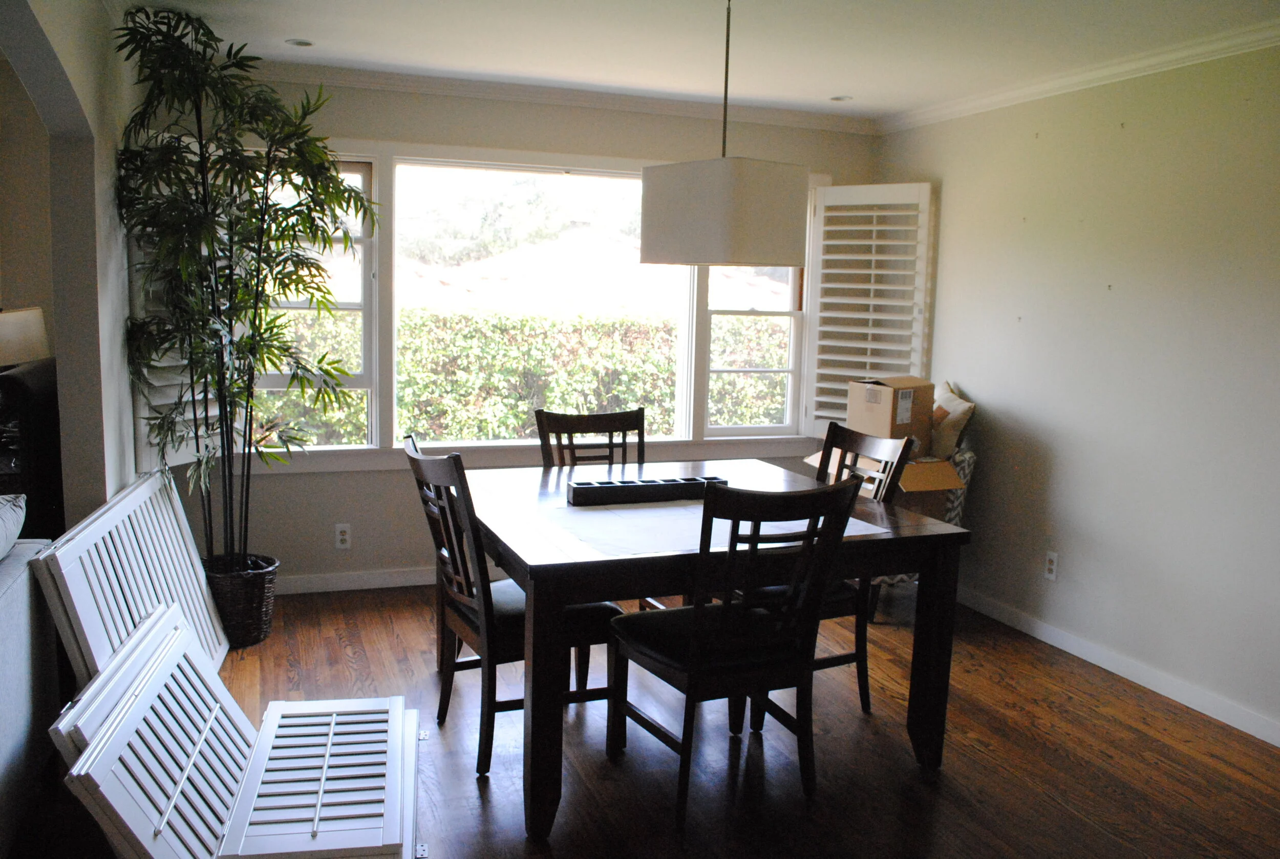
We went back and forth on what to do with this built in system. It provided ample storage and a good place to display pretty little things but the couple couldn’t decide if they wanted to keep the bookshelves or have a clean wall instead where they could display some artwork.

So the design plan was pretty straight forward. Let’s keep it neutral, simple and elegant. Let’s play with the natural light in this room and bring in warm driftwood tones and natural elements like capiz shells and botanicals, sprinkle a little gold here and there and bam! Enjoy a grown up space.

In fact, those were the exact words from my client “I feel so grown up sitting here!”.

We saved a little bit of money by using a sofa they had in another room and using their existing coffee table that they were very fond of.
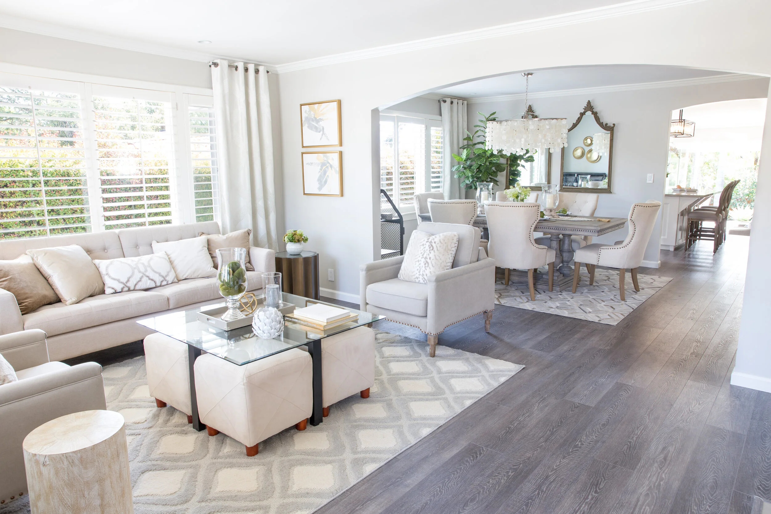
The capiz shell chandelier was definitely a striking addition in this small dining room but my favorite piece is the cow hide rug! And, notice we decided to put back those wooden shutters because after all they did provide privacy but also because they added an extra layer of texture and dimension to this whole space since we didn’t have too many colors or patterns to work with.

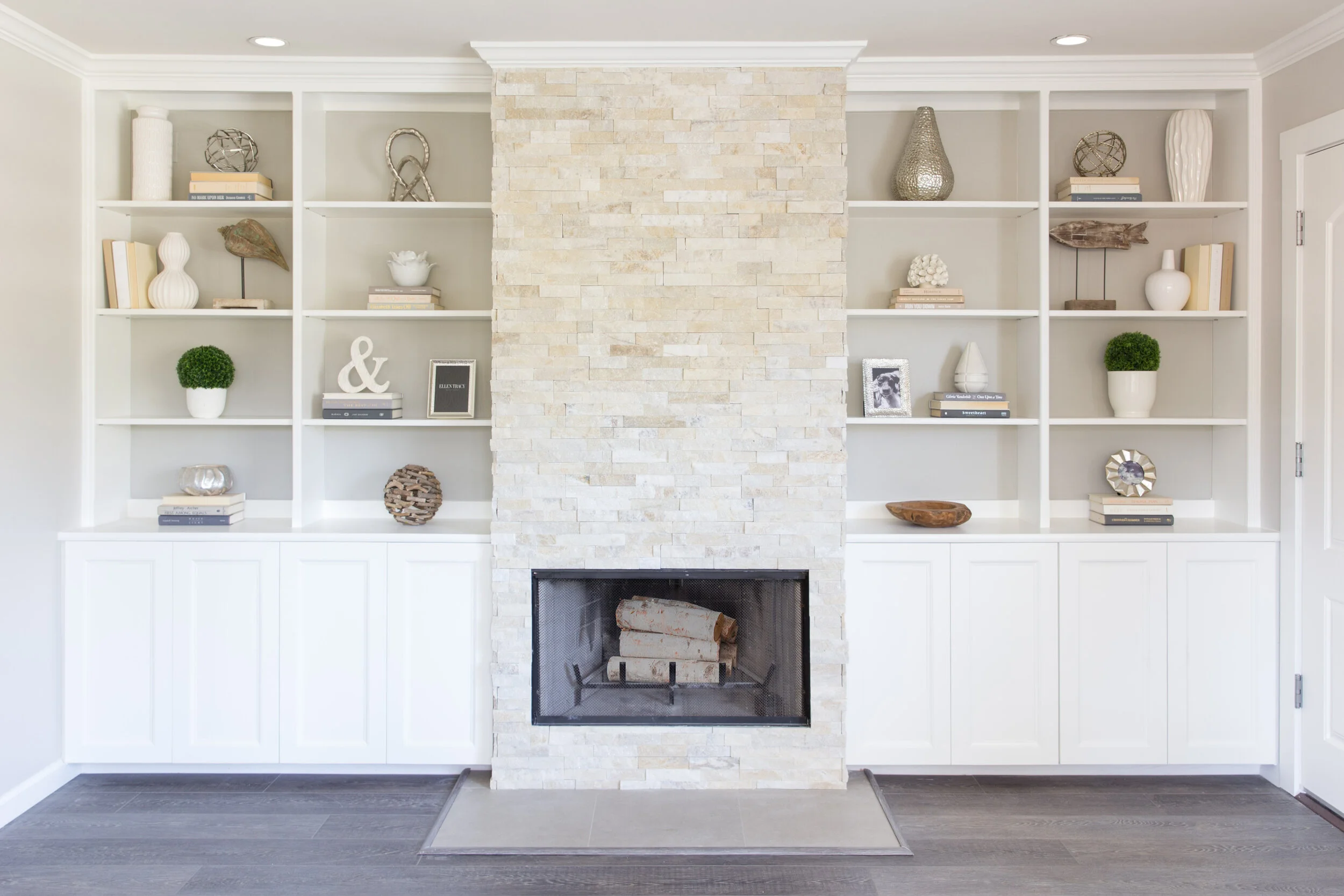
In the end, we decided to keep the beautiful built-in cabinets flanking the fireplace. We eliminated some of the shelves, painted the back wall a light grey, refinished the fireplace facade, and added a wood trim to the cabinet doors to make them a little more interesting. We also added some fun knobs (not seen here).


Doesn’t this space look so much brighter and fresher? It is a cool grown up place to hang out and read a book and enjoy some peace and quite!
XX
Claudia
A Glamorous Bathroom Renovation You Need To See To Believe
How should I begin to tell you the massive transformation this long and plenty-full master bathroom underwent? Well, they do say that a picture says a thousand words, so I will let the pictures speak for themselves and I’ll just tell you the basics.
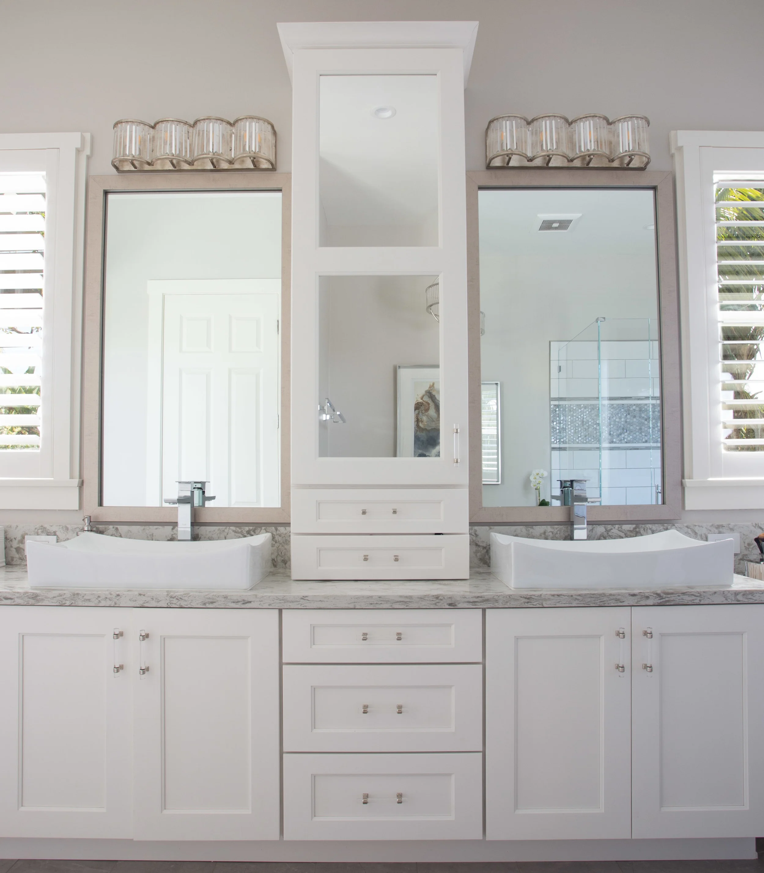
As with every project, we had a few problems to solve. In this case it was a storage problem. Now, I know what you’re thinking - there’s plenty of storage in that bathroom already. Yes, you’re right. This vanity did have massive amounts of storage, however, it was not all functional, and as you can see by all the stuff on the counters, it was not enough!


So I began by dreaming up a glamorous and elegant master bathroom full of natural light, with all new white cabinetry, brushed nickel plumbing fixtures, a sexy free standing bathtub, and just enough bling from the lighting fixtures, cabinet hardware and glass tile to satisfy the Mrs’ request for femininity and sophistication, while keeping the Mr. from jumping out the window.

The next step was designing the massive custom cabinet and adding in some much needed storage. The 3d rendering below really helped the clients visualize their new space. By adding a tower in the center of the vanity I was able to create ‘his’ and ‘hers’ separate spaces. ‘His’ space was off to the left with ample countertop space and plenty of drawers and storage. ‘Her’ space was, well, everything else - the center tower and all the drawers below for all her jams and jellies, the cute makeup vanity because every girl should have one, and the all the drawers in the right tower for little trinkets and such. We reserved the visible storage behind the glass for pretty little things.

3d rendering of bathroom vanity
It was time to say good-bye to the yellow walls and outdated tile that made this bathroom look dark.

The new color palette was soft and calming like the rest of the house. Every room in this house flows beautifully because of the continuous serene ambiance we created intentionally throughout.


So, what do you think? Is it too feminine? Does it entice you to come and soak in the tub after a long day of work?


xo,
Claudia

How We Created A Fabulous Spa Experience In This Guest Bathroom
Designing an entire home is definitely my favorite type of project. This adorable San Roque home had great bones, with some nice built-ins throughout, a spacious floorplan that had undergone a room addition in the past, good size bathrooms, decent sized bedrooms and plenty of space to reconfigure the kitchen and create a true chef’s kitchen. It was blessed with gorgeous natural light and located in a quite neighborhood so I was eager to turn this cozy home into the beauty queen I knew it could be. The process took over a year. We did a few rooms at a time, leaving the kitchen and master en-suite for last.
Oddly enough, we began by tearing up the guest bathroom! This poor room was in serious need of some lovin’. The homeowners dreamed of a serene, zen-like space where their overnight guests would feel like they had checked into a spa. Ok, no problem! Consider it done!

Before Images
The homeowners wanted a very neutral color palette with no dramatic colors or patterns. So I began by selecting a driftwood finish vanity paired with grey and white tiles, soft silver lighting fixtures, brushed nickel plumbing and elegant glass apothecary jars to hold some bathroom essentials that would double as decor. This simple design was elegant, yet serene and just what they wanted. With a plan in hand we hit the ground running.

Demo day is always fun, exciting and scary all at once. You never know what you’re going to find when you start tearing things up. We discovered that the electrical

The challenge was finding a ready-made vanity that would fit the entire length of the wall - 112” to be exact. Almost impossible. So I designed and drew a custom vanity and took my drawings to a local craftsman to fabricate. The vanity provides a ton of open storage for pretty little things and deep drawers to store the not so pretty things. The over-sized mirror was in perfect condition so we saved money by leaving it in. We did refinished the frame to match though.

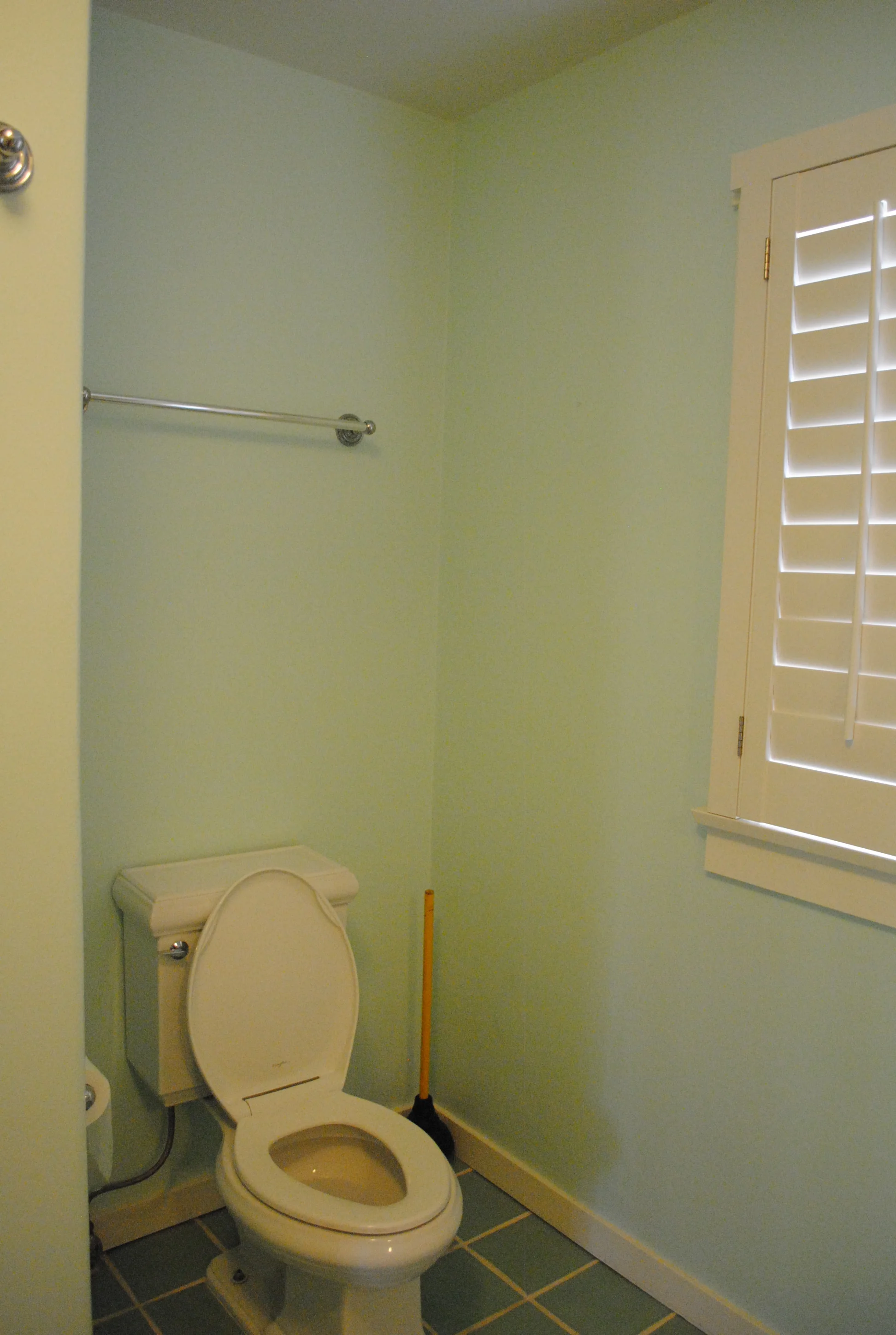
By removing the overhead soffit we were able to place the sconces a little higher up which made a huge difference! We painted the walls in a warm taupey/grey, installed all new lighting and plumbing including a new toilet, kept the white wooden shutters and even re-used the existing glass shower surround!

The once colorful and eclectic bathroom, finally found it’s softer and quieter side! Now, tell me. How would you feel being a guest in this house? Relaxed? Peaceful? Pampered? All of the above for me!

Check out these dramatic before and afters.


Hope you enjoyed!
Up next in this San Roque Beauty…The master bedroom.
xo,